Naked Lime
In 2014, I had the pleasure of being one of four people on the direct mail team at Naked Lime Marketing in Houston, Texas. My job there was primarily to design direct mail templates which would then be advertised to our clients (car dealers around the country). I would come up with or be assigned a theme, then create a design based on that theme and apply it across several different sizes/types of direct mail pieces. I often created a logotype and some copy for the templates as well.
These are some of the templates I designed, as well as a couple of custom jobs for a dealer I often worked with.


"Picture Yourself" Direct Mail Template Design
This design was created for a mid-winter release, and rather than go with a seasonal theme, I decided to go for a loud and happy color palette. My thinking was that January and February are when people are ready to be DONE with winter, and a pop of color and excitement would be welcome in the gloomy weather. Its use of bold colors and "friendly" typefaces also convey the idea that shopping for a car should be a fun, tailored experience and that this car dealer will make it just that.

Custom Trifold Mailer Design for Dealer
At Naked Lime there were some clients who never bought any of the template packages, and instead requested a theme of their own invention. This dealer requested a trifold with a "Wanted Poster" theme. Using a combination of photography, textures, and slab serif typeface, along with a logo and color palette from Ram and Motor Trend Truck of the Year, I was able to create a piece that spoke to the brand as well as the dealer's request for a "Wanted" theme.

Custom Letter (Standard & Bifold) Design for Dealer
Here is another example of some custom work for a specific client. These pieces (all letters—a standard sized and two bifold ones) were part of a sales campaign this dealer was running for the 2015 Chrysler 200. In the first pieces, I drew from Chrysler's blue color palette and clean, geometric typography used in their ads for the 200 for brand cohesiveness. In the third piece of this campaign, the dealer insisted on using a new color palette. I decided on orange, since it is complementary to the blue used in previous pieces and contrasts nicely with the blue in the dealer-provided pictures.


"Get a Grip on Service" Direct Mail Template Design
In addition to vehicle sales campaigns, I also designed a lot of templates for advertising service specials. For this piece, I created a bit of nostalgia through the use of retro-style icons (stock images with varying levels of tweaking by me) and used a red, blue, and beige color palette for an Americana feel. The "Get a Grip" logomark I created provides a fun and memorable slogan for the campaign.


"Sweet Christmas" Direct Mail Template Design
This piece was a collaboration between myself and a coworker. Laura created the basic gingerbread house shape with the snow and sky, and I added in the candy (some stock art), and the "inside" of the gingerbread house, as well as all of the layout and typography. I love when two people can work together on a project and make it into one cohesive design.


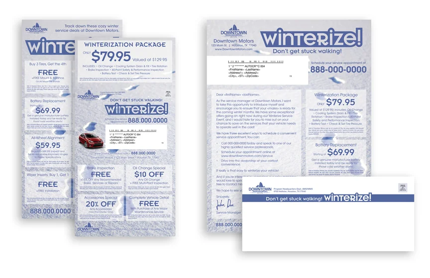
"Winterize" Direct Mail Template Design
This template was to remind our clients' customers that their cars require a little extra attention during the cold and wet months of winter. I designed it such that the logotype I created was the main emphasis of each piece. The one-word imperative to "winterize" their cars conveys the message quickly and emphatically.


